sBlot
Weight plots
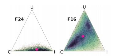
Weight plots visualise the posterior densities of the weights per feature: how well does each
component - the confounders and the clustering – explain the distribution of the feature in the
data? For example, a language analysis will likely have two confounders: inheritance and universal preference.
In this case, the weights are displayed in a triangular probability simplex. The lower right corner is the weight for inheritance
(I), the upper corner is the weight for universal preference (U), and the lower
left corner is the cluster weight (C). The figure below shows the weight plots for two features, F24 and F16. Inheritance and clustering best explain the distribution of F24, whereas F26 has no single
dominant explanation: the posterior weights are broadly distributed. The pink dot marks the
mean of the distribution. As with other plot types, sBlot returns the density
plots for all features in a single grid.